Project outcomes
Empowered brands driving over 90% of Yotpo Loyalty's ARR to adopt self-service with an industry-leading UX, strengthening Yotpo's leadership in loyalty.
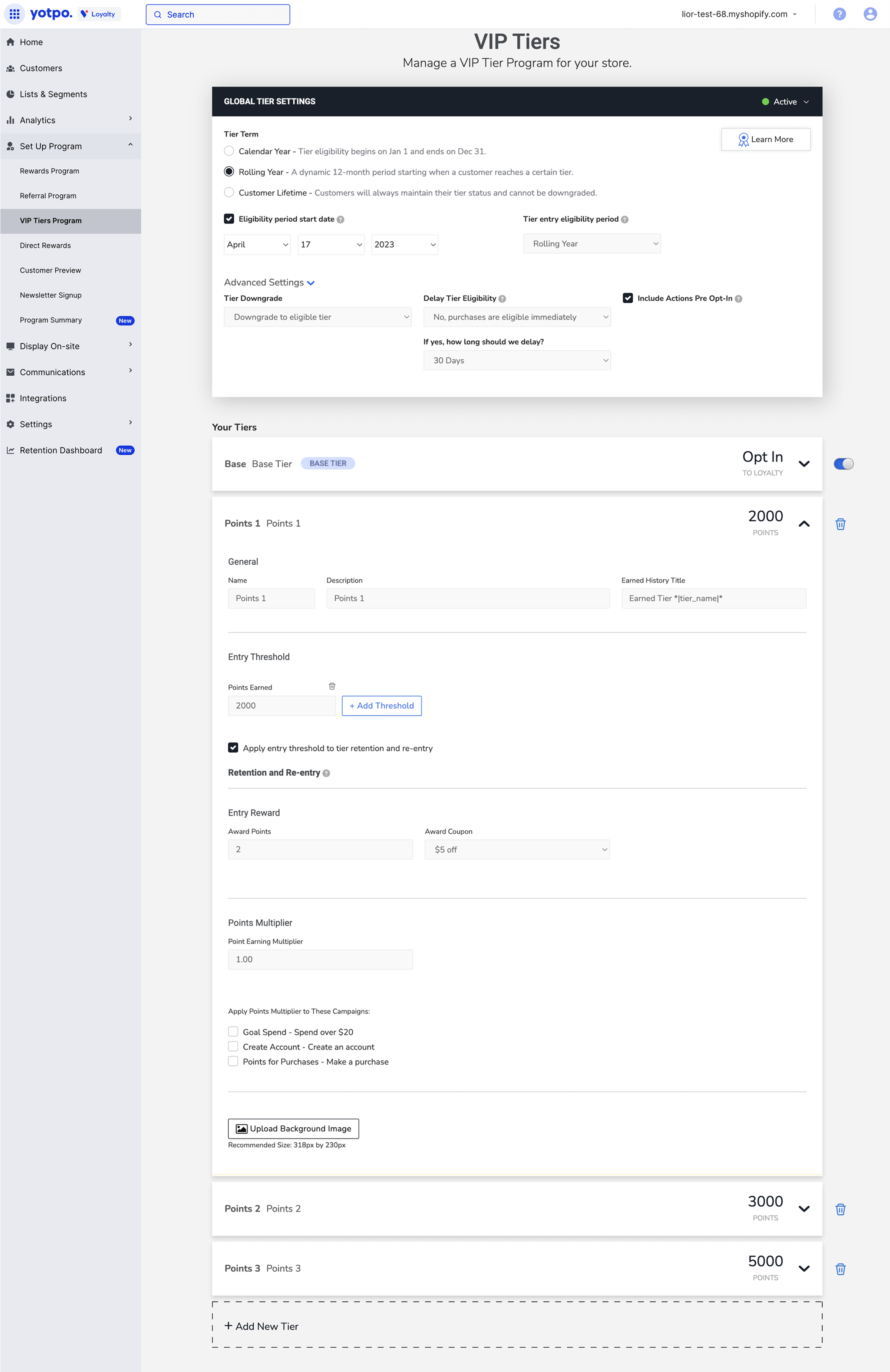
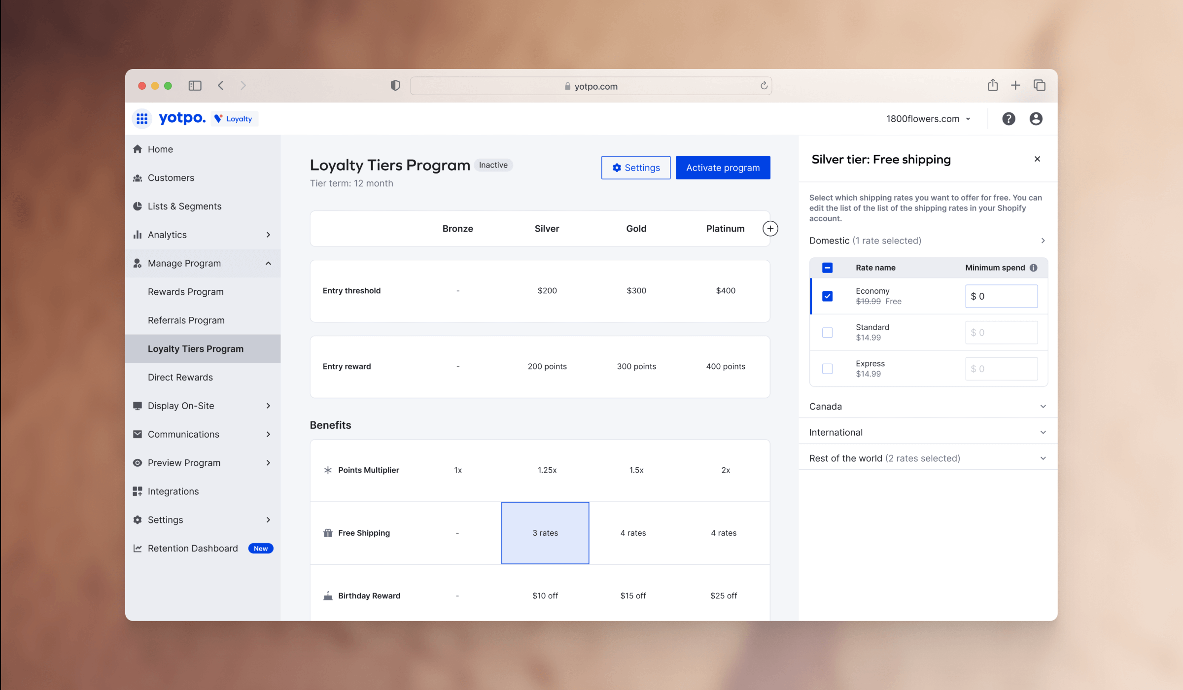
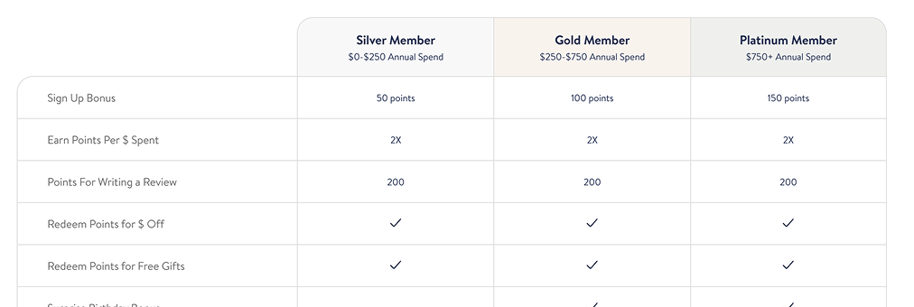
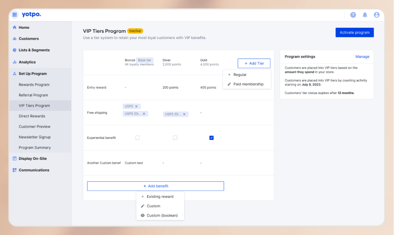
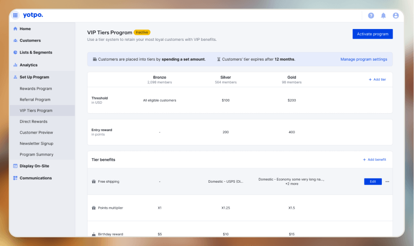
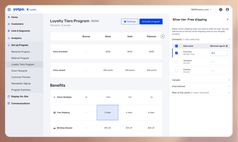
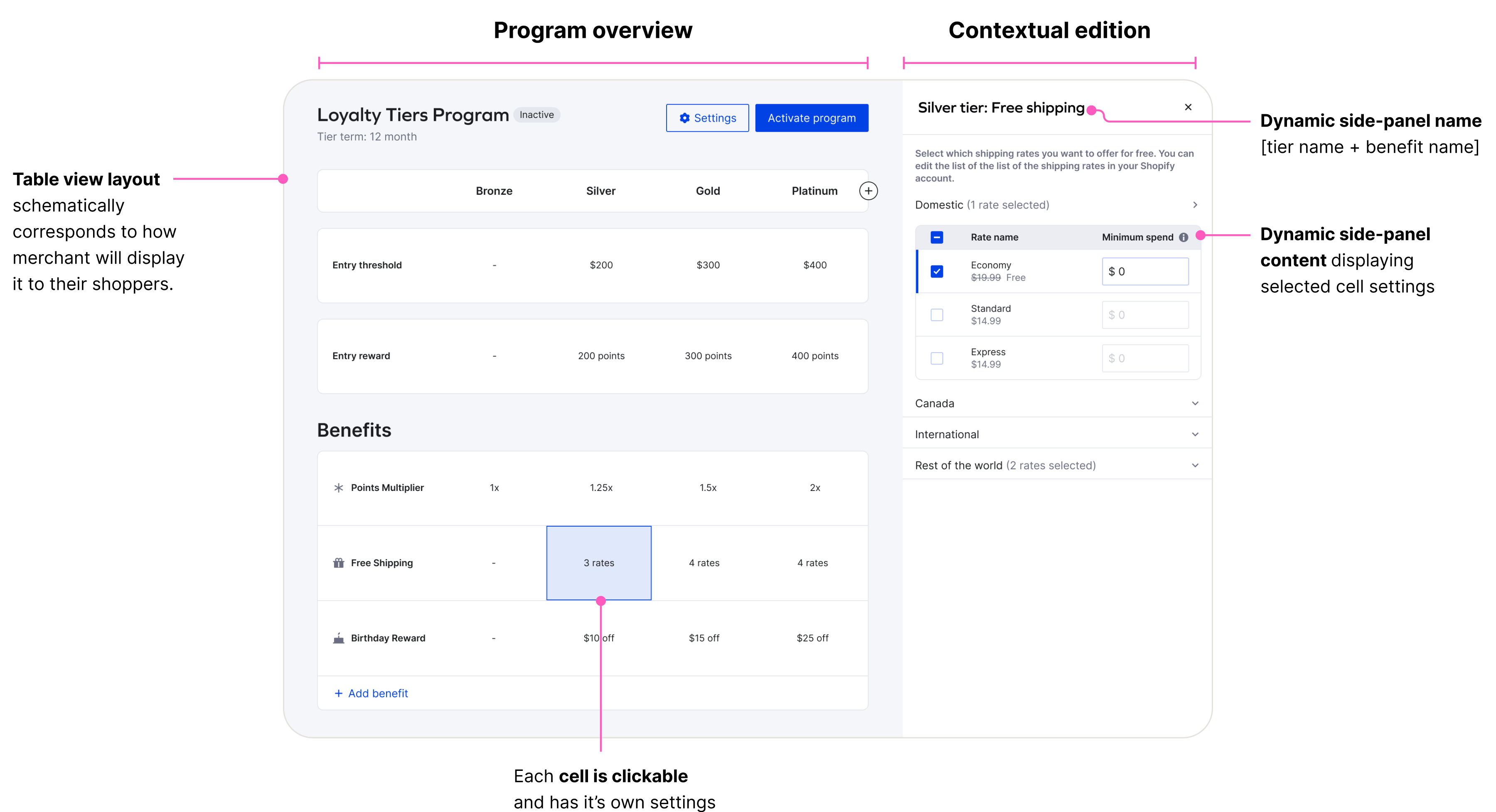
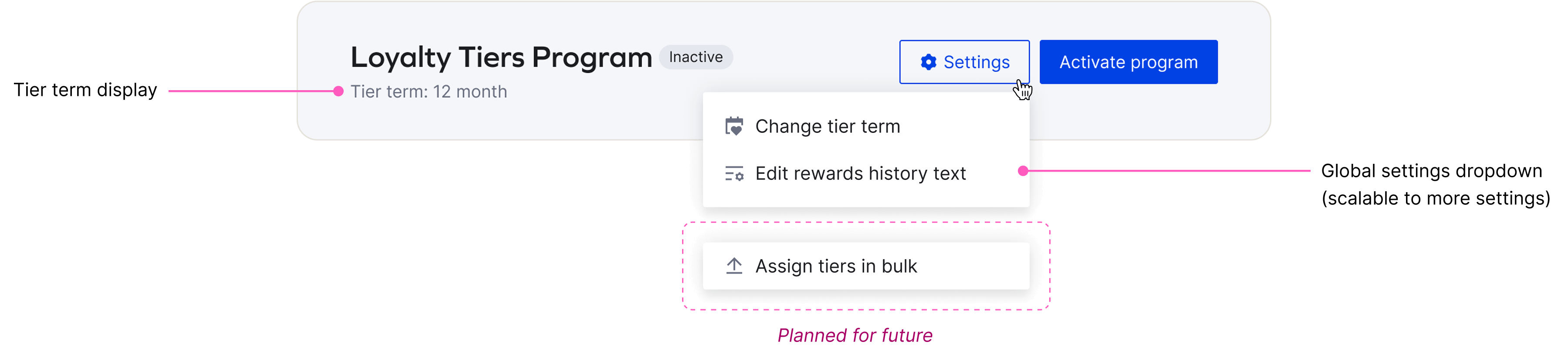
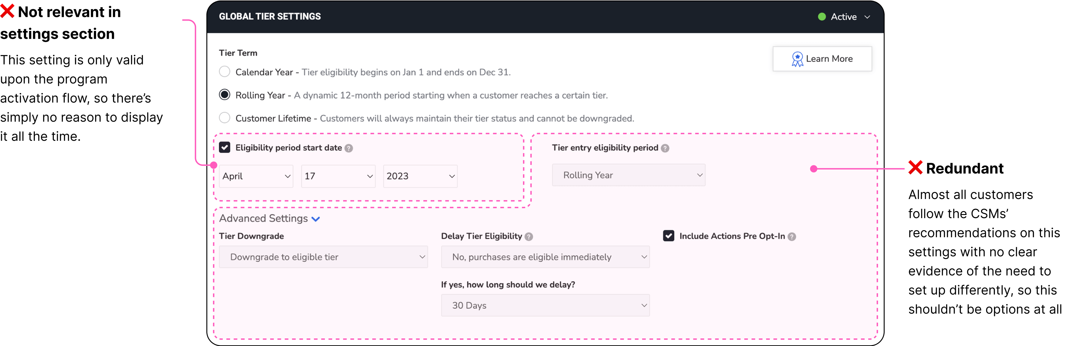
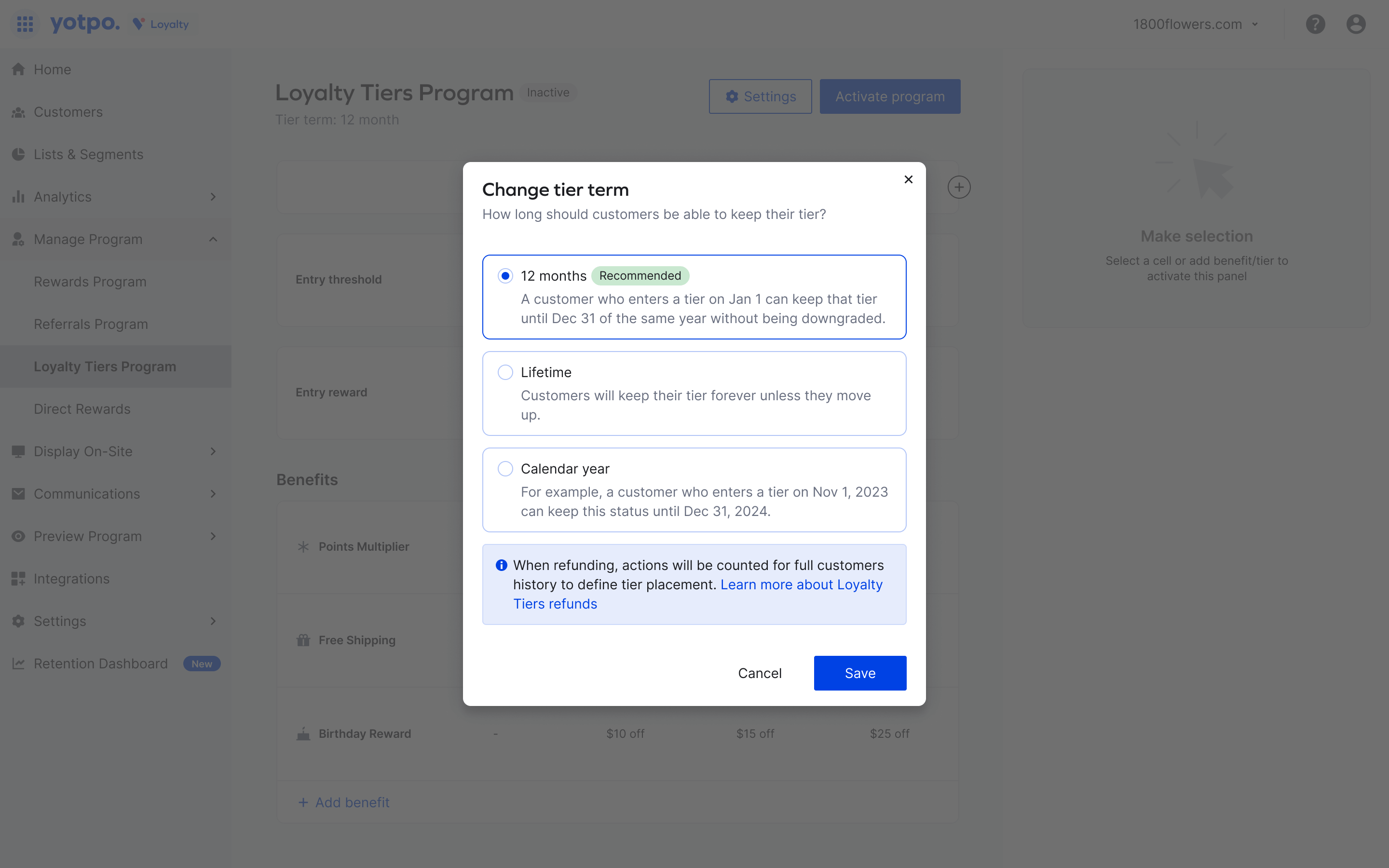
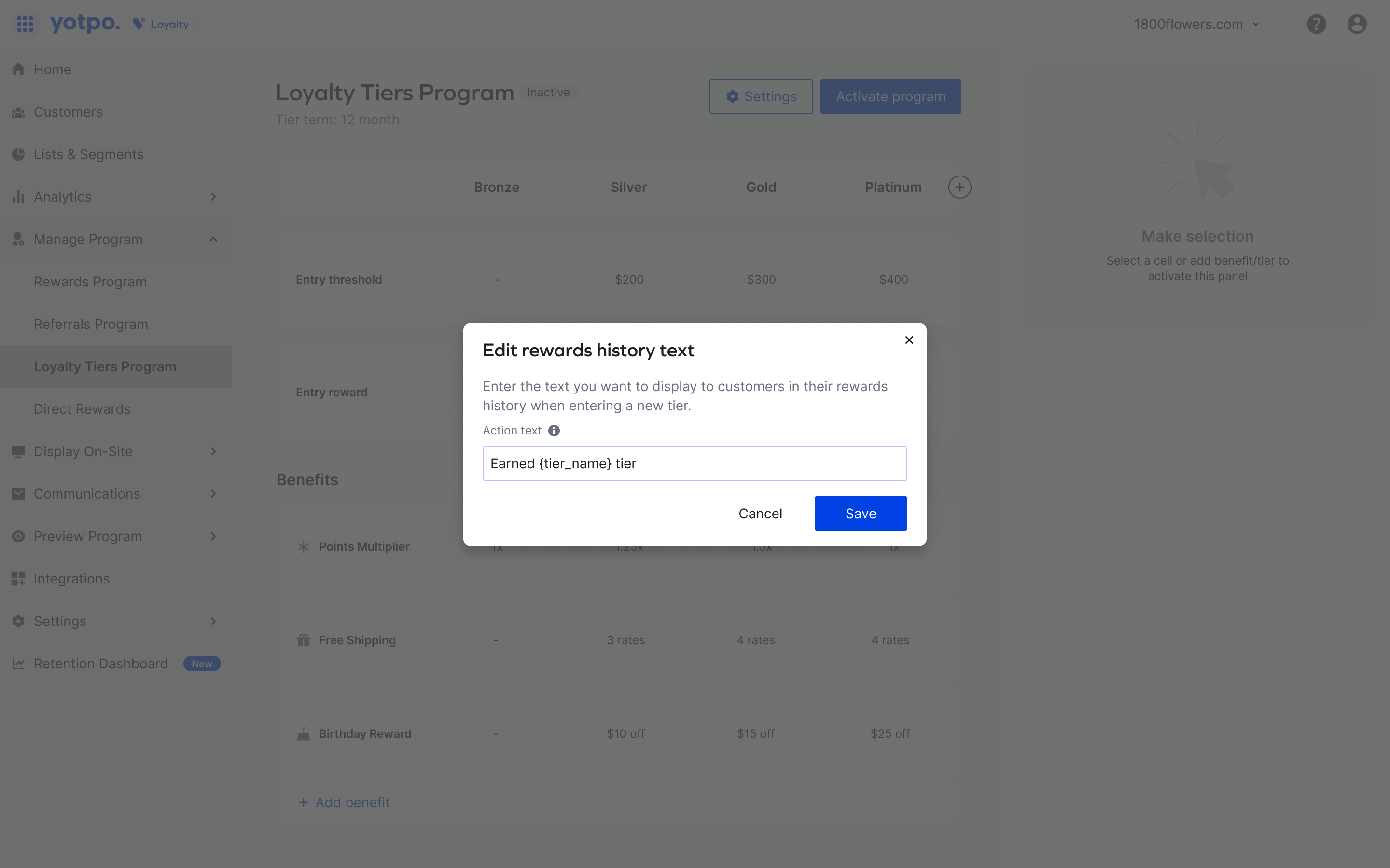
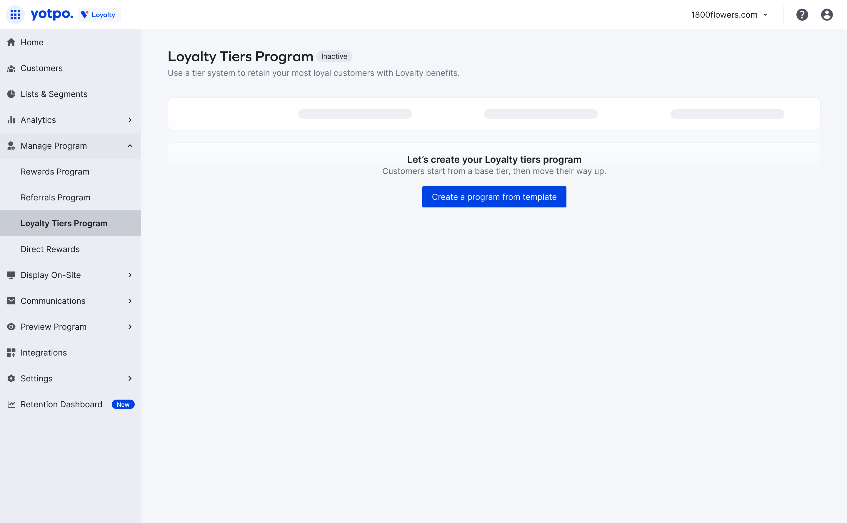
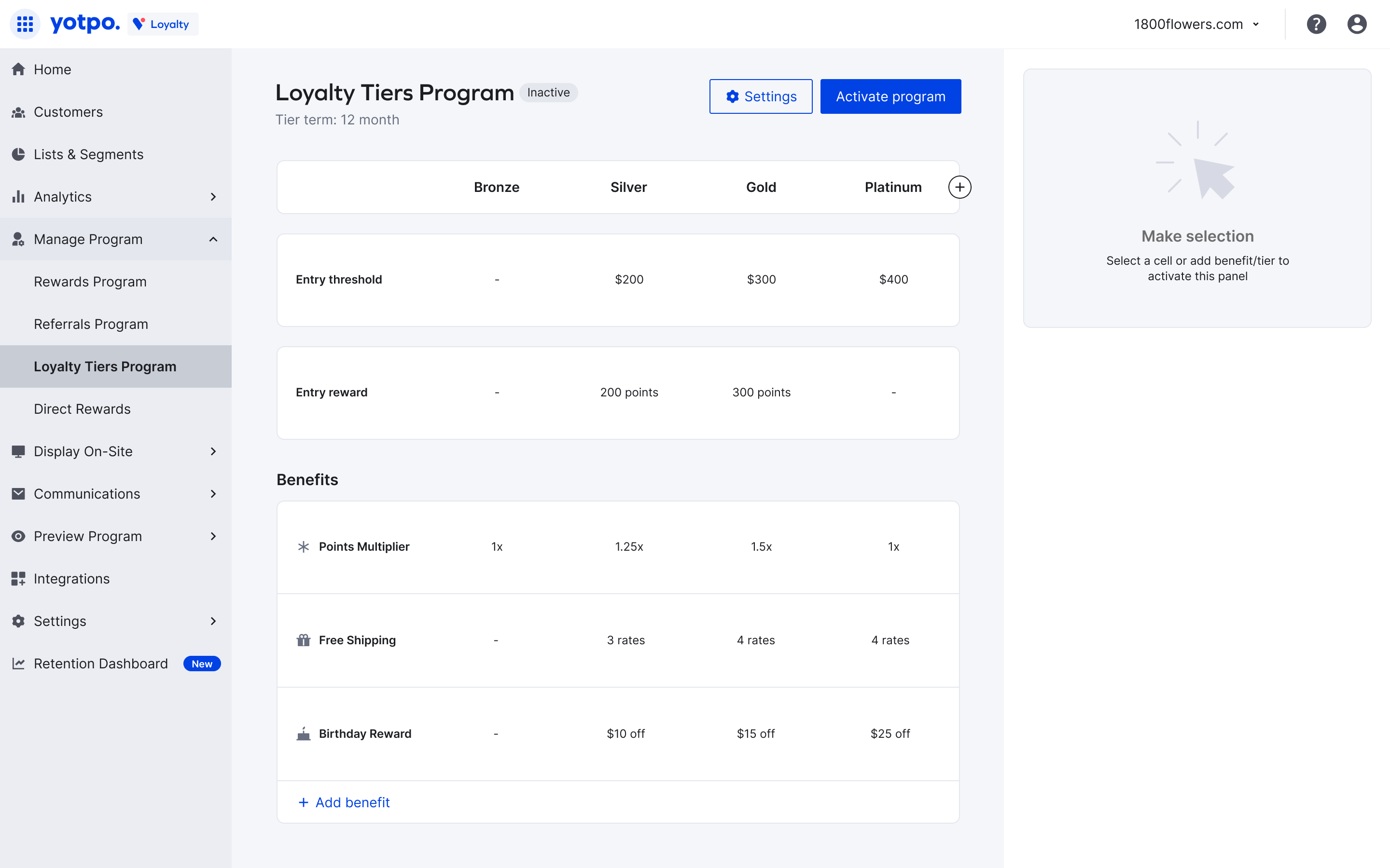
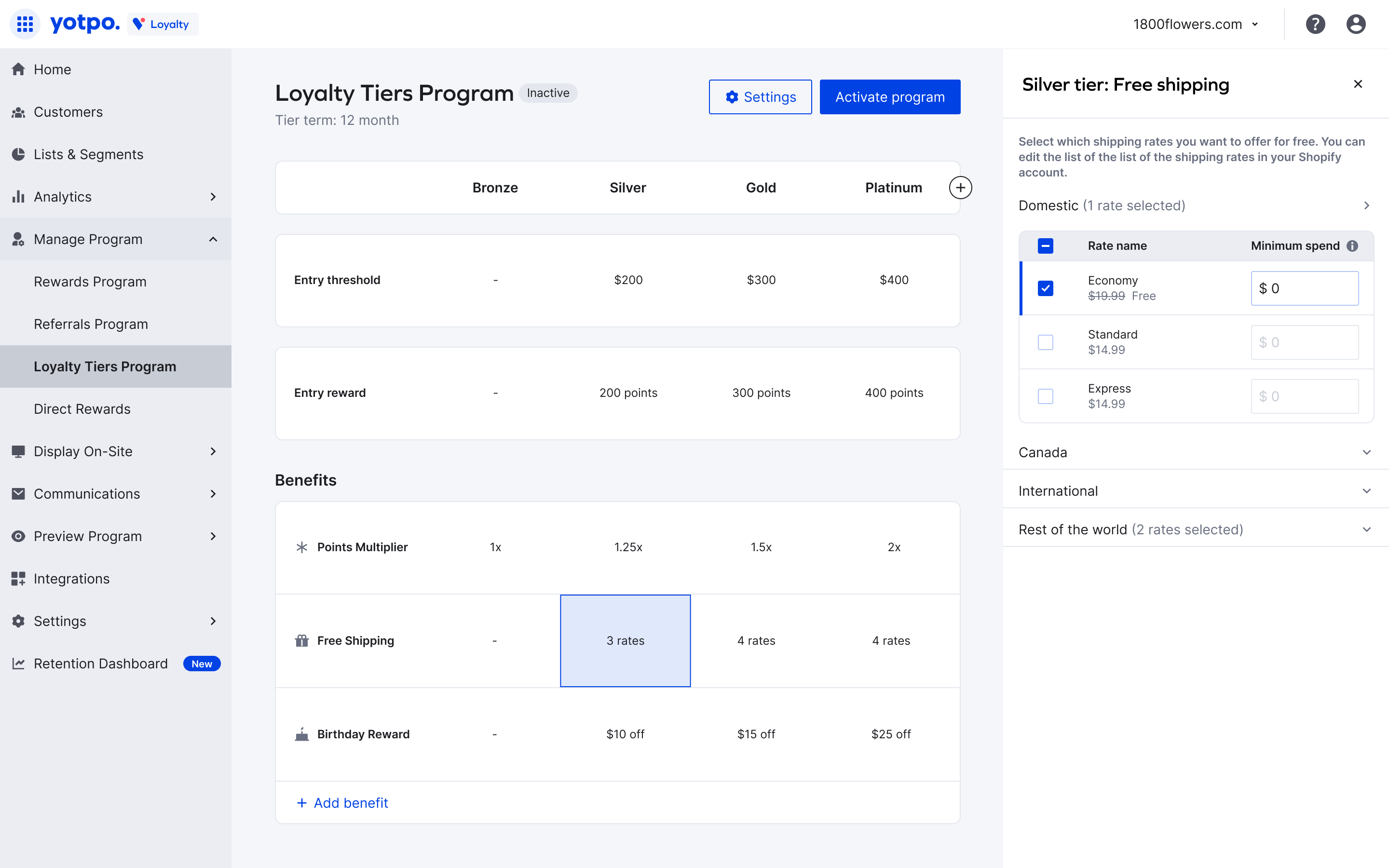
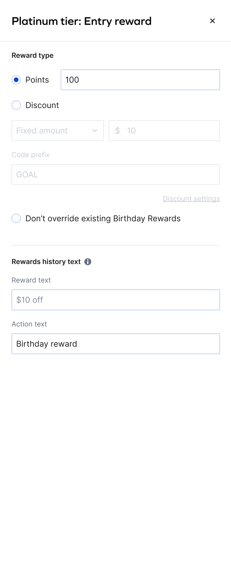
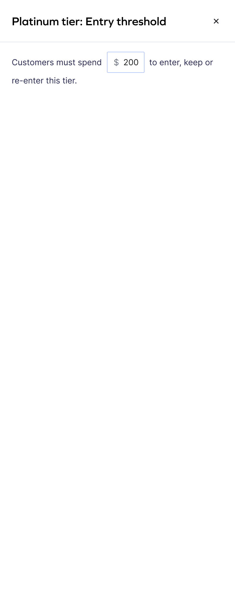
Increased self-serve adoption of Loyalty Tiers from ~10% to ~80% by redesigning the end-to-end creation and launch experience—shifting implementations from CSM-led to merchant-driven.